
Transforming a system-centered emergency infrastructure into a human-centered experience.
Product Designer | UX/UI | Design Systems | AI Product Architecture
Designing for human fragility means designing for resilience.
Living in a wildfire-prone area, I experienced firsthand the confusion and uncertainty that can surround emergency information.
That experience became the motivation to explore the problem more deeply, before I ever worked professionally in wildfire technology. I wanted to understand how people living with wildfire risk interpreted emergency information, what they needed in moments of uncertainty, and where existing systems were failing them.
We often witness disaster from a distance. We feel compassion, but rarely think deeply about our own preparedness until danger reaches our community.
When that happens, we expect governments and emergency services to protect and guide us. Yet natural disasters place enormous pressure on public systems, requiring fast coordination of shelters, transportation, animals, information, and emergency resources.
For residents, this can create a critical gap between being warned and knowing what to do next, while recovery afterward may depend on limited public assistance, insurance, and personal resilience.
The challenge became:
How might we help people prepare earlier, act with greater clarity, and become part of a more resilient community during wildfire emergencies?
People needed to know whether a fire actually affected their location.
During an emergency, people wanted a reliable way to communicate with family, friends, and neighbors, not only receive information from authorities.
Many residents did not know where nearby shelters or emergency resources were, especially those that could accommodate children, pets, or livestock.
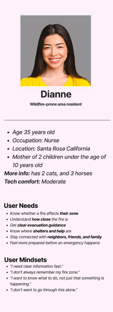
Dianne represents the patterns that emerged from the people I interviewed.
She lives in Santa Rosa, California with two young children, two cats, and three horses.
She is comfortable using technology, but in an emergency she does not want to interpret government terminology, search multiple websites, or figure out which shelter can accommodate her family and animals.
She needs to answer a few urgent questions quickly:
Her profile is grounded in the community the product was designed for.
Santa Rosa’s median age is 39.9, with adults ages 30–39 representing its largest age group. Families with children are also a significant part of the community, making household safety, evacuation, and preparedness especially relevant.
Source: Bay Area Census — Santa Rosa Household Demographics
The 2017 Tubbs Fire became one of the most destructive wildfires in California history at the time, burning 36,807 acres across Napa and Sonoma counties and destroying more than 5,600 structures. Calfire
For many residents, evacuation unfolded with little time to prepare. Gaps in emergency communication and situational awareness meant that some people had to make critical decisions as the fire was already approaching. California report assessment
I spoke with more than 20 people living in wildfire-prone communities, including people affected by the Tubbs Fire, residents who had evacuated during other fires, and people who had lost their homes.
I wanted to understand what happens when an emergency stops being information on a map and becomes personal:
What did people need to know? What information could they find? What did they take with them? And what became important when there was almost no time left to decide?
A simple question exposed a much bigger problem
Do you know what fire zone you live in?
100% of the people I interviewed could not confidently answer. Some tried to remember their zone and got it wrong.
I tried to find the answer with them. What seemed like a simple question led us through county websites, CAL FIRE resources, different maps, classifications, and zone systems.
The problem wasn’t that people failed to remember their fire zone. It was how much they were expected to understand before they could answer a basic question about their own safety.
System Centered Architecture
The system was designed around the system
The infrastructure was designed around the needs of the organizations operating it. The resident-facing experience inherited that architecture.
These classifications and codes support wildfire science, logistics, planning, and emergency operations. But residents are expected to understand and remember pieces of that institutional structure in order to interpret what is happening around them.
People don’t experience an emergency as a jurisdiction, classification, or code.
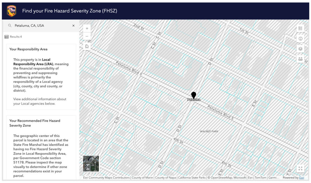
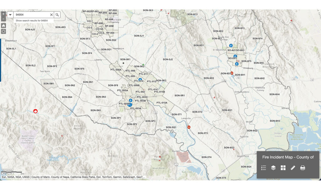
Both systems contain important information. Neither reflects how people described their needs during an emergency.

The research showed that people needed more than emergency alerts. They needed critical information and connections established before an emergency began.
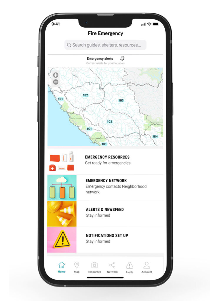
Rather than asking residents to navigate different agency systems, the product would use their location to establish geographic context and bring preparedness into one place: emergency notifications, trusted contacts, community connections, shelters and resources, and an evacuation plan.
Community became part of the infrastructure.
During large natural disasters, emergency resources can become stretched. The people already nearby family, neighbors, friends, and community members—can become an important layer of communication, awareness, and support.
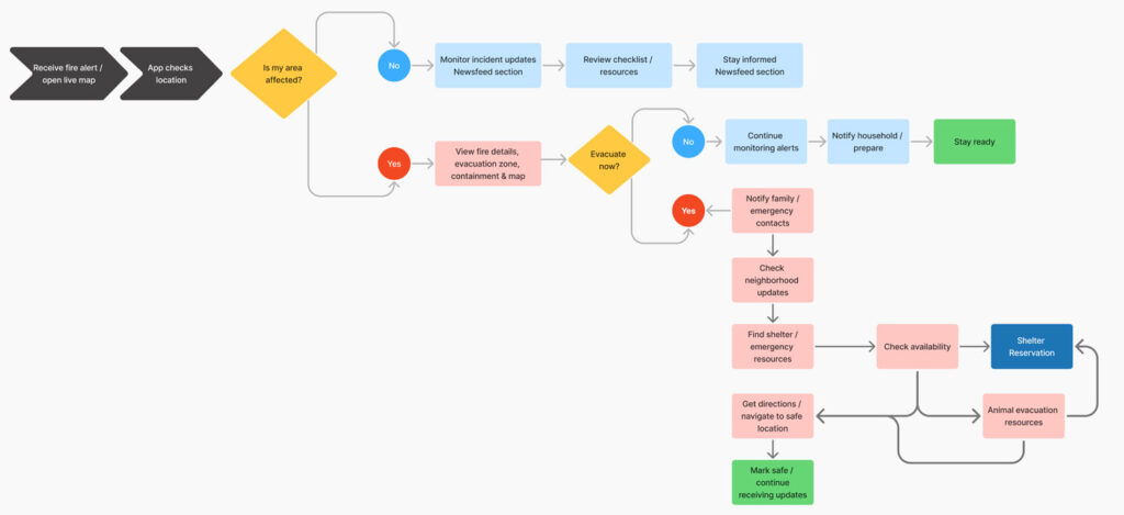
During an active wildfire, the interaction needed to become linear, explicit, and predictable.
This wasn’t an application designed for leisurely exploration or everyday engagement. People would be using it while already under stress, potentially deciding whether to leave their homes, move their families and animals, or seek immediate shelter.
The architecture therefore reduces unnecessary choices and organizes the experience around simple, consequential questions:
Is my area affected?
Do I need to evacuate?
Where can I go?
Who needs to know?
Whenever possible, the system resolves complexity in the background; location, affected areas, available resources, contacts, and routes, so the person can focus on the next action.
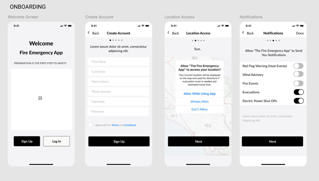
The wireframes established a simple constraint: every element needed to help people understand, decide, or act quickly.
Because the app may be used during high-stress situations, the interface was intentionally kept clean and predictable. Primary actions use consistent placement and generous touch targets, while secondary information remains visually subordinate.
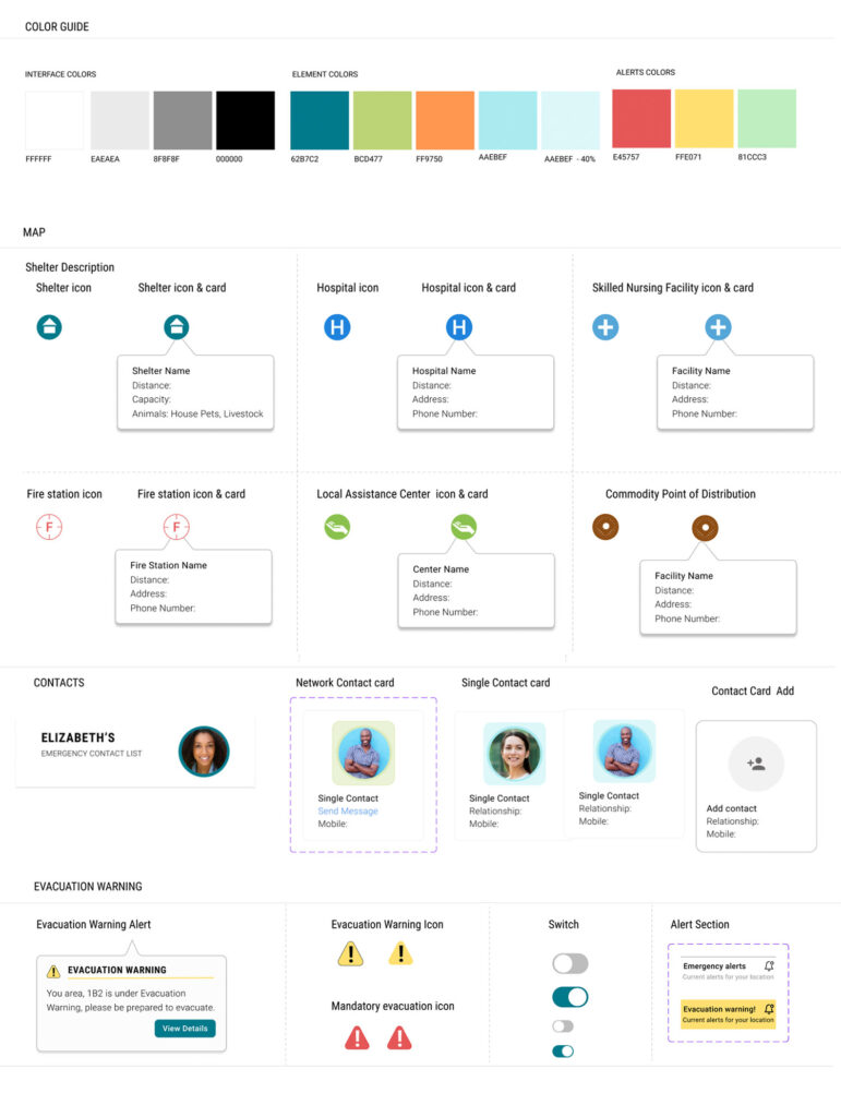
Use language, symbols, and emergency conventions people already recognize.
Maintain consistent colors, icons, controls, and behaviors throughout the experience.
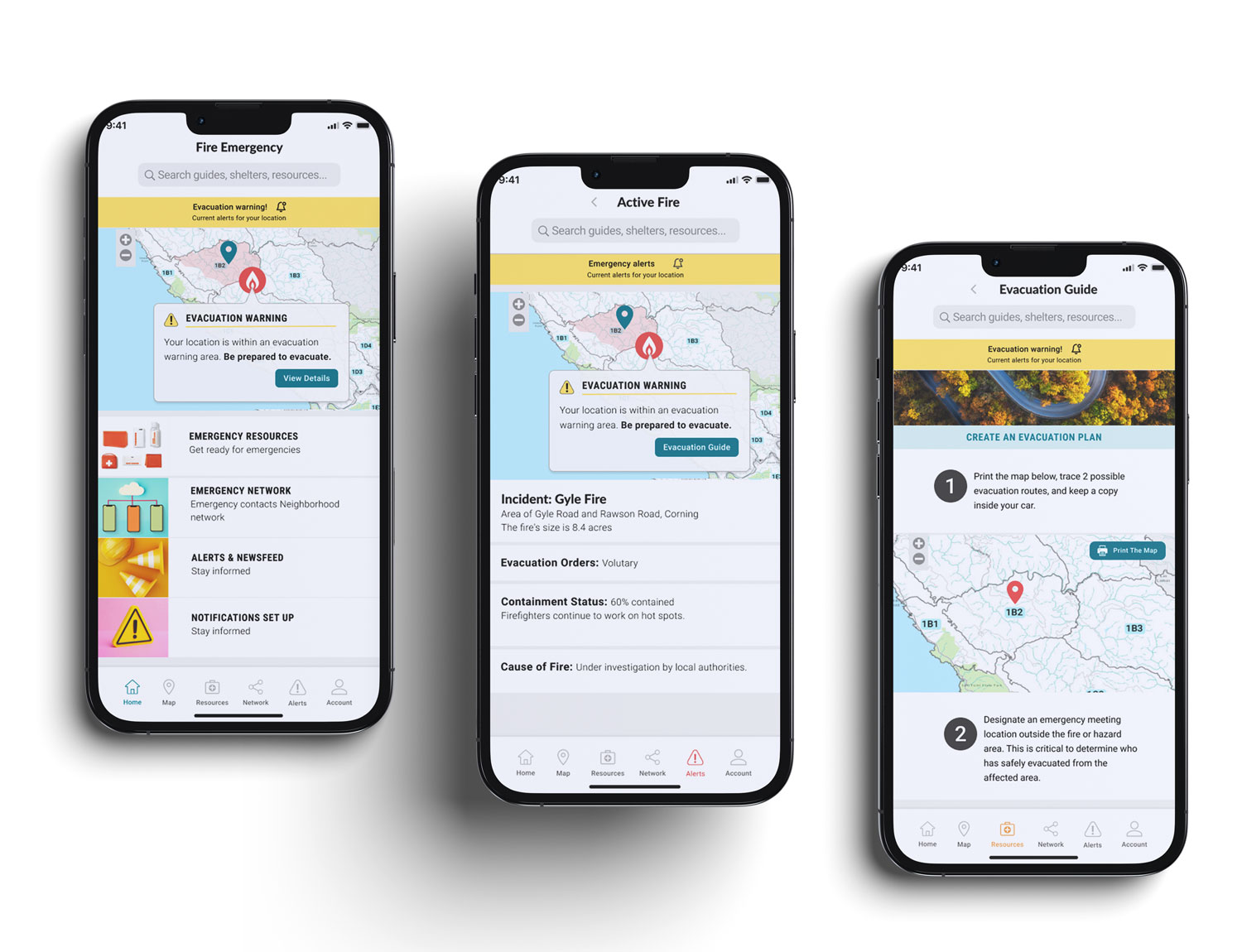
The implementation translated the research, information architecture, and design system into a functional mobile experience centered on one question: what does this person need to know or do right now?
Location provides context, allowing the interface to connect emergency information to the resident rather than requiring them to interpret zones or classifications. Alert states change the hierarchy of the interface as conditions change, bringing warnings, incident information, evacuation guidance, resources, and community connections forward when they become relevant.
The underlying systems remain complex. The experience presented to the resident does not have to be.
More than Features, Resources
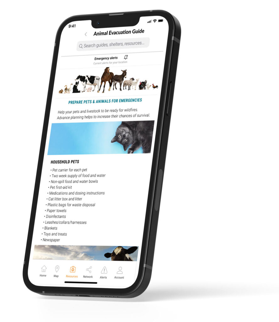
Preparedness extends beyond receiving an alert. The experience brings emergency resources, evacuation planning, personal contacts, and neighborhood connections into one accessible system before they are urgently needed.
Residents can build a go-kit, locate shelters and animal evacuation resources, establish emergency contacts, and create a neighborhood network—reducing the number of decisions and searches required when conditions become critical.
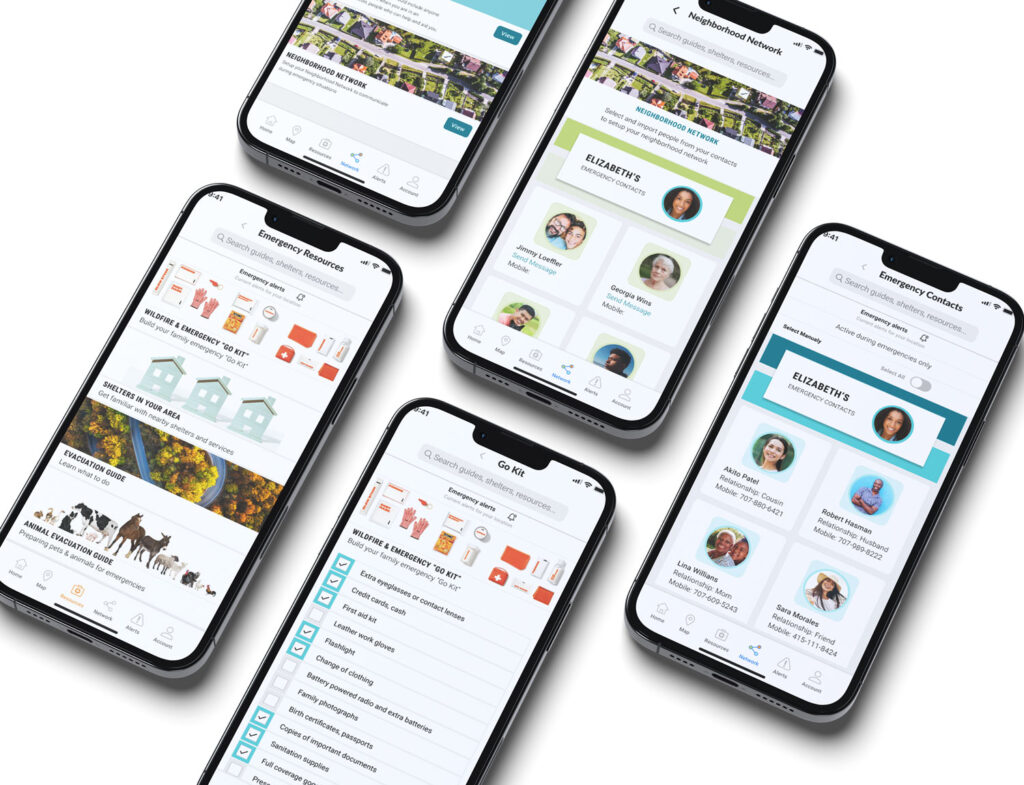
The final experience brings wildfire information, preparedness resources, emergency contacts, and location-aware guidance into one coherent system.
Complex classifications and fragmented information are translated into clear, contextual guidance, helping residents prepare before an emergency and act quickly when conditions change.
The complexity remains in the system not in the user’s head.
Designing for human fragility means designing for resilience.
Living in a wildfire-prone area, I experienced firsthand the confusion and uncertainty that can surround emergency information.
That experience became the motivation to explore the problem more deeply, before I ever worked professionally in wildfire technology. I wanted to understand how people living with wildfire risk interpreted emergency information, what they needed in moments of uncertainty, and where existing systems were failing them.
We often witness disaster from a distance. We feel compassion, but rarely think deeply about our own preparedness until danger reaches our community.
When that happens, we expect governments and emergency services to protect and guide us. Yet natural disasters place enormous pressure on public systems, requiring fast coordination of shelters, transportation, animals, information, and emergency resources.
For residents, this can create a critical gap between being warned and knowing what to do next, while recovery afterward may depend on limited public assistance, insurance, and personal resilience.
The challenge became:
How might we help people prepare earlier, act with greater clarity, and become part of a more resilient community during wildfire emergencies?
People needed to know whether a fire actually affected their location.
During an emergency, people wanted a reliable way to communicate with family, friends, and neighbors, not only receive information from authorities.
Many residents did not know where nearby shelters or emergency resources were, especially those that could accommodate children, pets, or livestock.
Dianne represents the patterns that emerged from the people I interviewed.
She lives in Santa Rosa, California with two young children, two cats, and three horses.
She is comfortable using technology, but in an emergency she does not want to interpret government terminology, search multiple websites, or figure out which shelter can accommodate her family and animals.
She needs to answer a few urgent questions quickly:
Her profile is grounded in the community the product was designed for.
Santa Rosa’s median age is 39.9, with adults ages 30–39 representing its largest age group. Families with children are also a significant part of the community, making household safety, evacuation, and preparedness especially relevant.
Source: Bay Area Census — Santa Rosa Household Demographics
The 2017 Tubbs Fire became one of the most destructive wildfires in California history at the time, burning 36,807 acres across Napa and Sonoma counties and destroying more than 5,600 structures. Calfire
For many residents, evacuation unfolded with little time to prepare. Gaps in emergency communication and situational awareness meant that some people had to make critical decisions as the fire was already approaching. California report assessment
I spoke with more than 20 people living in wildfire-prone communities, including people affected by the Tubbs Fire, residents who had evacuated during other fires, and people who had lost their homes.
I wanted to understand what happens when an emergency stops being information on a map and becomes personal:
What did people need to know? What information could they find? What did they take with them? And what became important when there was almost no time left to decide?
A simple question exposed a much bigger problem
Do you know what fire zone you live in?
The system was designed around the system
The infrastructure was designed around the needs of the organizations operating it. The resident-facing experience inherited that architecture.
These classifications and codes support wildfire science, logistics, planning, and emergency operations. But residents are expected to understand and remember pieces of that institutional structure in order to interpret what is happening around them.
People don’t experience an emergency as a jurisdiction, classification, or code.
Both systems contain important information. Neither reflects how people described their needs during an emergency.
The research showed that people needed more than emergency alerts. They needed critical information and connections established before an emergency began.
Rather than asking residents to navigate different agency systems, the product would use their location to establish geographic context and bring preparedness into one place: emergency notifications, trusted contacts, community connections, shelters and resources, and an evacuation plan.
Community became part of the infrastructure.
During large natural disasters, emergency resources can become stretched. The people already nearby family, neighbors, friends, and community members—can become an important layer of communication, awareness, and support.
During an active wildfire, the interaction needed to become linear, explicit, and predictable.
This wasn’t an application designed for leisurely exploration or everyday engagement. People would be using it while already under stress, potentially deciding whether to leave their homes, move their families and animals, or seek immediate shelter.
The architecture therefore reduces unnecessary choices and organizes the experience around simple, consequential questions:
Is my area affected?
Do I need to evacuate?
Where can I go?
Who needs to know?
Whenever possible, the system resolves complexity in the background; location, affected areas, available resources, contacts, and routes, so the person can focus on the next action.
The wireframes established a simple constraint: every element needed to help people understand, decide, or act quickly.
Because the app may be used during high-stress situations, the interface was intentionally kept clean and predictable. Primary actions use consistent placement and generous touch targets, while secondary information remains visually subordinate.
Use language, symbols, and emergency conventions people already recognize.
Maintain consistent colors, icons, controls, and behaviors throughout the experience.
The implementation translated the research, information architecture, and design system into a functional mobile experience centered on one question: what does this person need to know or do right now?
Location provides context, allowing the interface to connect emergency information to the resident rather than requiring them to interpret zones or classifications. Alert states change the hierarchy of the interface as conditions change, bringing warnings, incident information, evacuation guidance, resources, and community connections forward when they become relevant.
The underlying systems remain complex. The experience presented to the resident does not have to be.
The goal is not simply to produce interfaces faster. It is to create a system that can scale knowledge, design quality, and regional decision support at the same time.
The system is designed to reduce the time between a regional question and a usable decision-support interface. By combining reusable components, AI-assisted recommendations, shared standards, and structured system logic, SERVIR could accelerate data selection, dashboard and report creation, and production across regional hubs while reducing duplicated work and implementation cost.
Faster production is only valuable if quality is preserved. The architecture also embeds rules for accessibility, evidence, citations, uncertainty, component behavior, and validation so that increased speed can be paired with stronger consistency and scientific integrity rather than simply generating more output.