Redesign a highly specialized scientific tool without compromising the models, terminology, and workflows experienced users depend on, while reducing complexity and making the system easier to learn, navigate, and use.
Challenge
Redesign a highly specialized scientific tool without compromising the models, terminology, and workflows experienced users depend on, while reducing complexity and making the system easier to learn, navigate, and use.
Users
BehavePlus supports a specialized community of wildfire professionals working across incident response, prescribed fire, land management, research, and education.
Fire Analysts
Near-term fire behavior analysis and forecasting
Incident Operations
Division supervisors · Firefighters · Incident support teams
Type 1 & 2 firefighters · Technical support for active fire operations
User Research that Shaped the Design Strategy
To understand how wildfire professionals use BehavePlus, I conducted an initial research study combining surveys and focus-group discussions. The research examined usability challenges, user experience levels, and opportunities to simplify workflows without compromising the scientific rigor of the system.
participants
66 wildfire professionals, researchers, and educators participated, providing perspectives from both experienced BehavePlus users and people newer to the software.
Insights
The research revealed a central tension: users valued the scientific power of BehavePlus, but needed simpler workflows and more accessible controls.
1
SIMPLIFY THE WORKFLOW
Users needed fewer steps and clearer pathways through complex modeling tasks without reducing the scientific capabilities of BehavePlus.
2
REDUCE THE LEARNING CURVE
New and occasional users struggled to understand where to begin, while experienced users relied heavily on familiarity and training to navigate the system.
3
MAKE INPUTS EASIER TO UNDERSTAND
Technical parameters, terminology, and configuration options needed stronger context and clearer guidance at the point of use.
4
IMPROVE NAVIGATION & ORIENTATION
Users needed a clearer sense of where they were in the workflow, what had already been configured, and what remained before running a model.
5
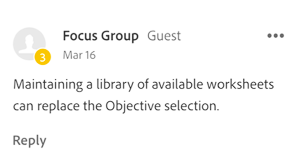
SUPPORT REUSE, NOT REPETITION
Frequently used configurations and worksheets needed to be easier to save, retrieve, modify, and reuse rather than rebuilt for every analysis.
6
PRESERVE SCIENTIFIC POWER
Simplification could not come at the expense of BehavePlus’s modeling capabilities. The redesign needed to make the system easier to understand while preserving its scientific complexity.
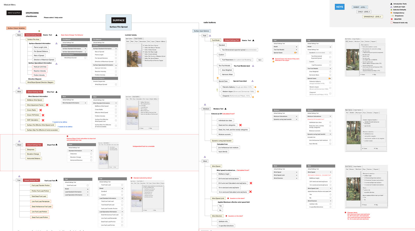
Reviewing the existing application structure to evaluate its tools, components, relationships, and relevance to user workflows.
BehavePlus 7 Interface architecture and workflow mapping used to identify complexity and redundant interaction paths
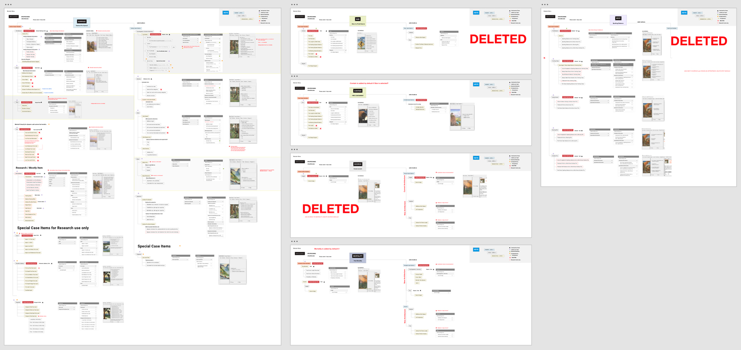
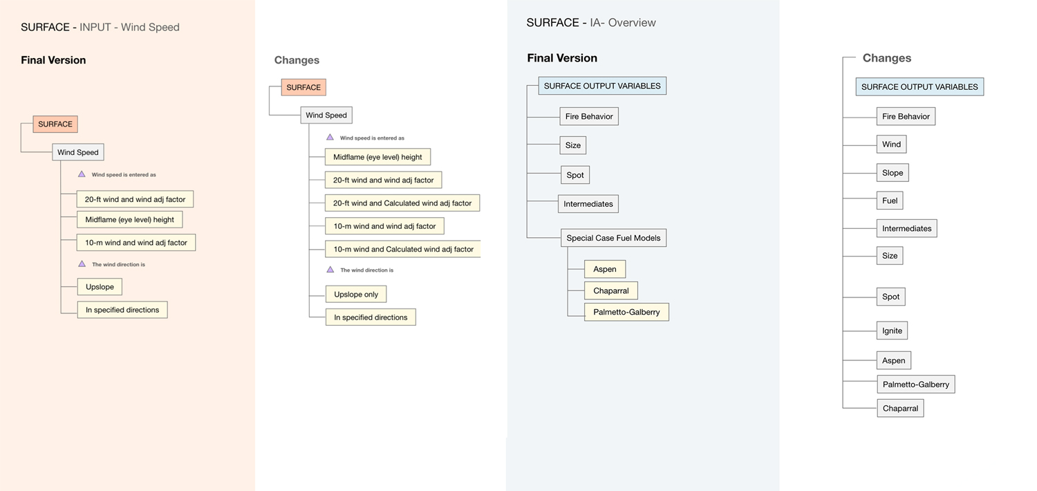
Mapping module relationships and calculation dependencies in the BehavePlus modeling system
Architecture
System architecture analysis revealed that the interface mirrored the internal scientific model rather than the mental models of its users.
I mapped the existing workflows, modules, controls, and calculation dependencies to understand how the system was structured and where complexity accumulated. This analysis exposed redundant paths, overlapping controls, and opportunities to reorganize the experience around user tasks while preserving the scientific relationships behind the models.
Design System
The design system evolved through multiple iterations, with each prototype tested against the needs of the people who would actually use it.
The second prototype moved the design from assumptions to observed behavior.
Testing revealed that several interface decisions did not match how users actually interacted with the system. Two findings had the greatest impact: typography was too small for comfortable extended use, and users expected the progress indicator to function as navigation.
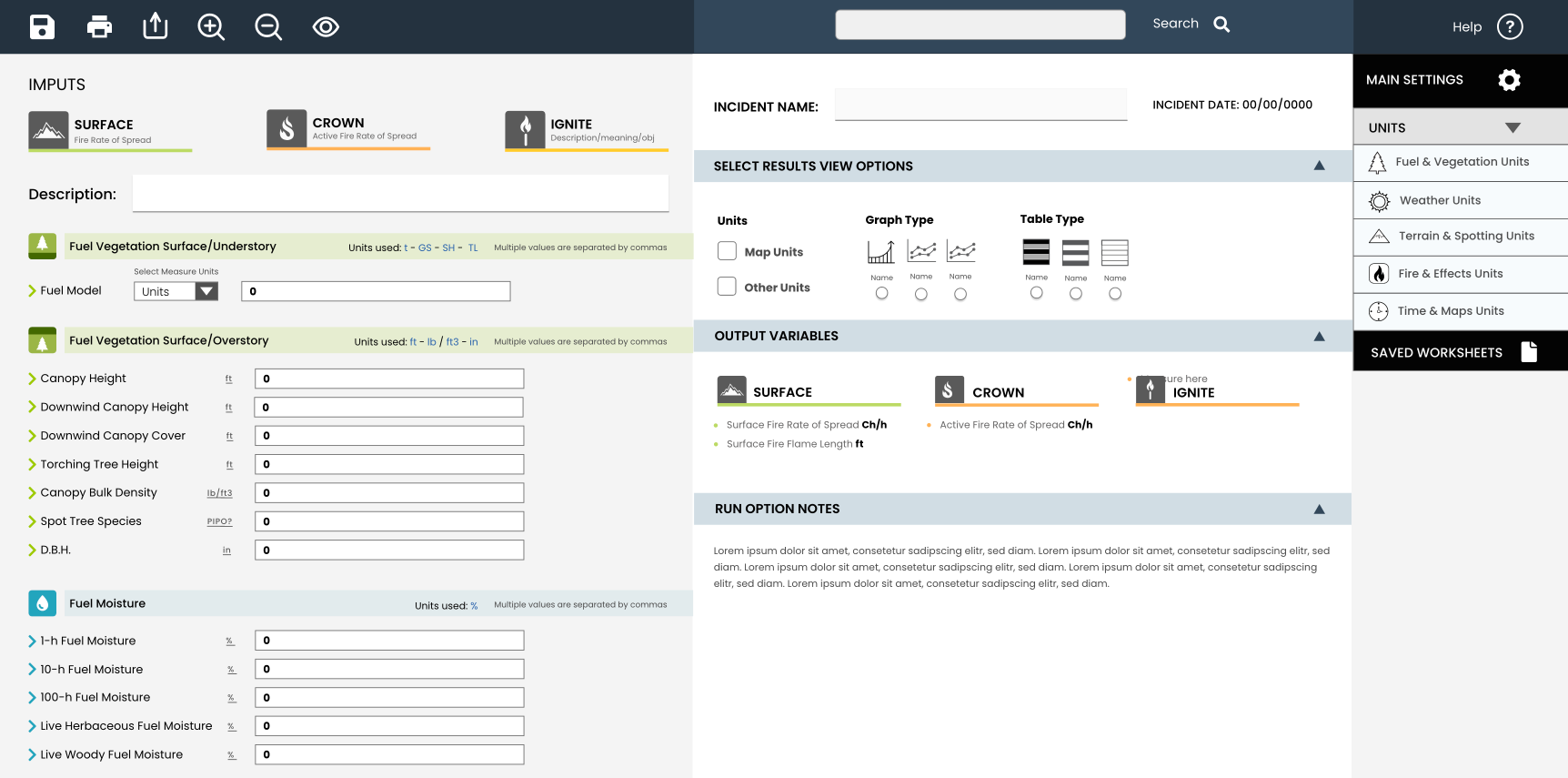
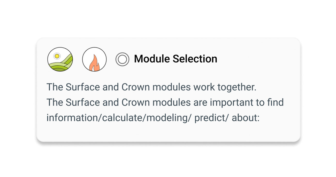
BehavePlus first prototype
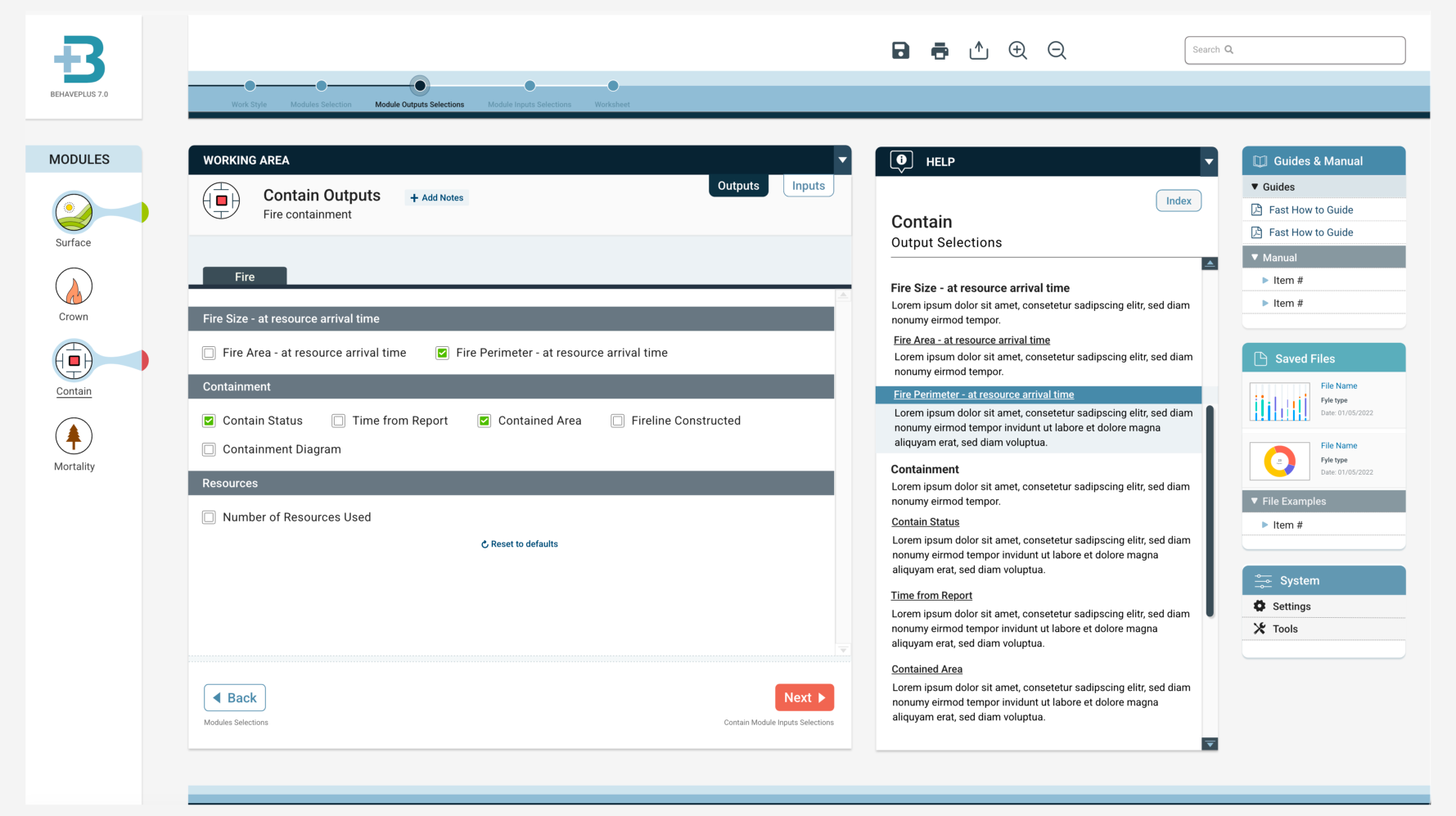
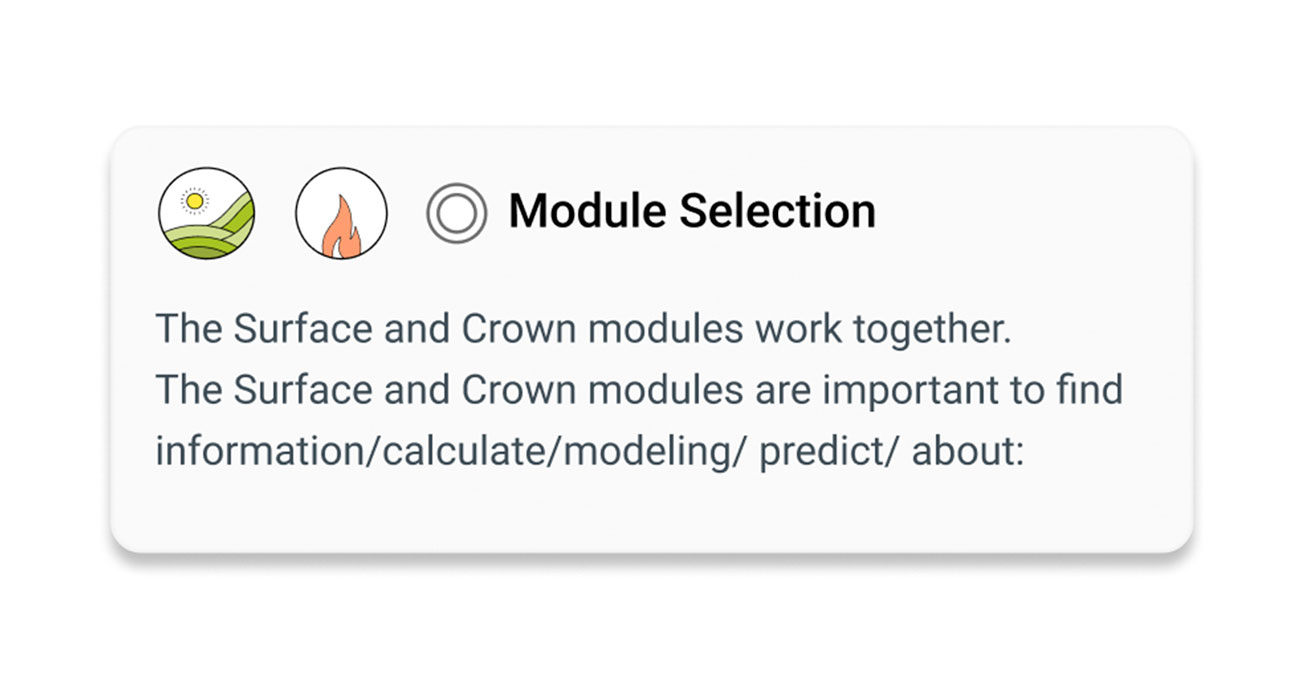
BehavePlus prototype for user testing
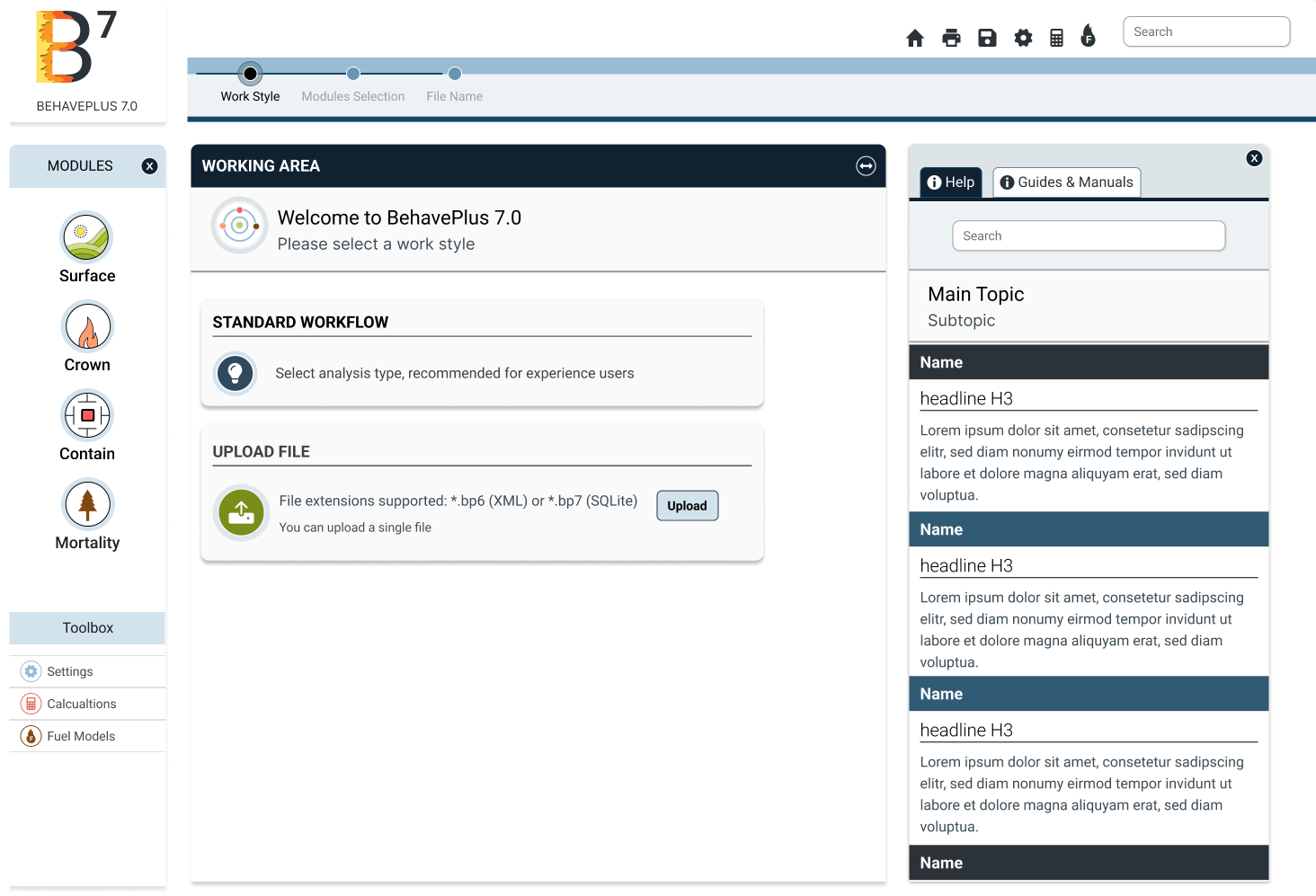
BehavePlus prototype after user testing
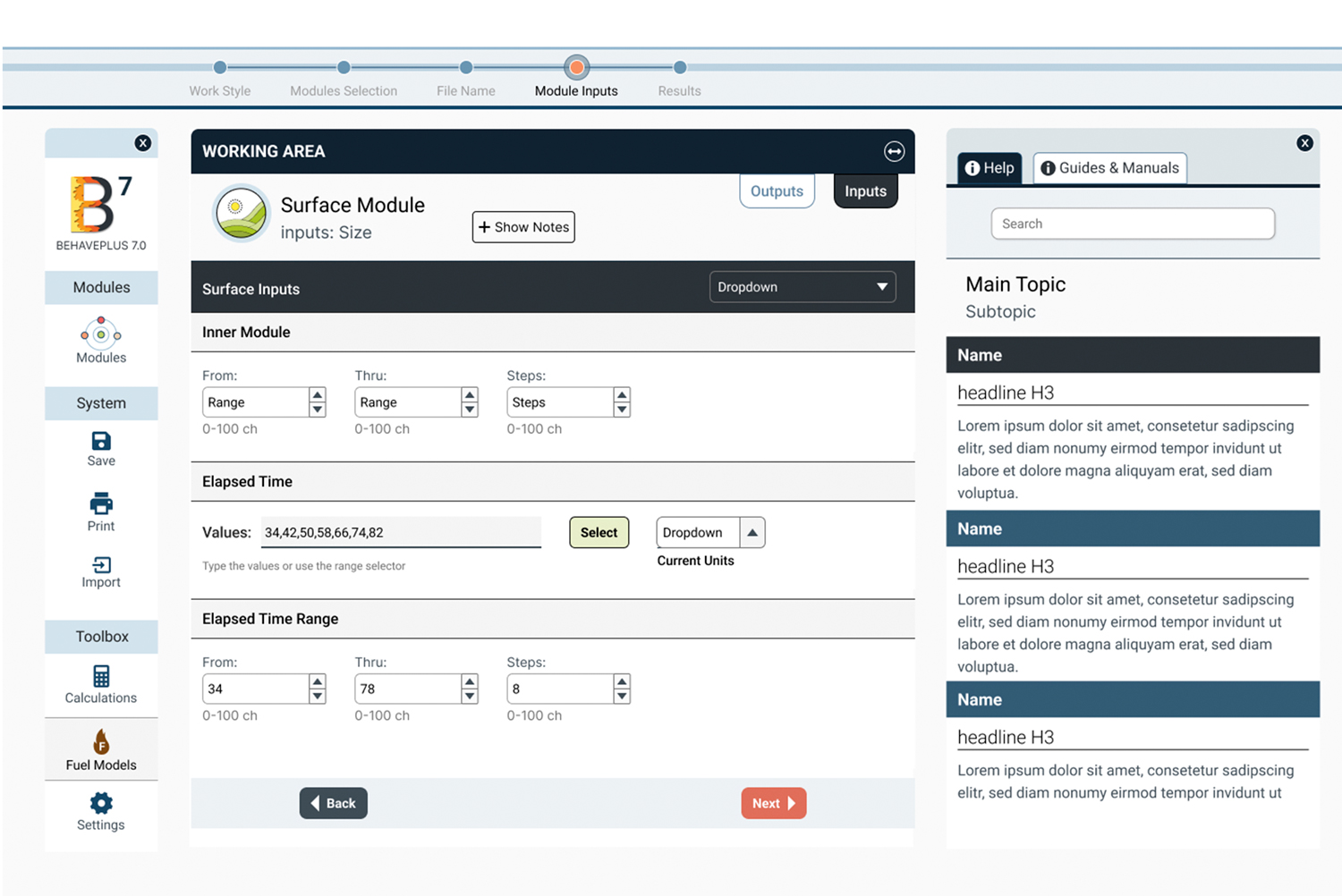
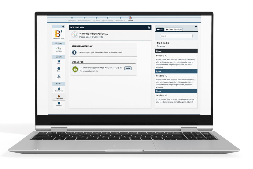
New BehavePlus 7 design
Prototype Evolution
Two findings had a particularly significant impact on the design.
TYPOGRAPHY & READABILITY
Testing shifted typography from a visual-system decision to an accessibility and usability requirement.
The initial type scale was too small for comfortable extended use. Testing with BehavePlus users revealed the need for greater readability among experienced professionals who often use the software for prolonged periods. The typography system was revised with larger type and improved readability to reduce visual strain during extended use.
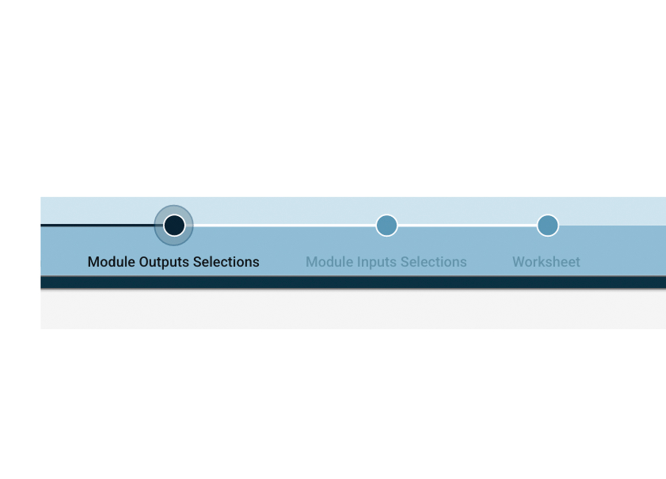
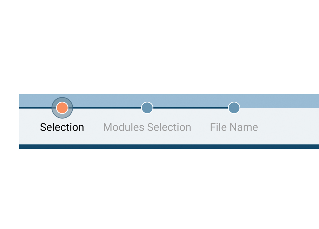
PROGRESS INDICATOR → NAVIGATION
Testing revealed that users understood the progress bar as an interactive navigation tool, not simply a status indicator.
During usability testing, participants repeatedly attempted to use the progress indicator to move between stages of the workflow. The interaction pattern was consistent enough to change the design. The component was redesigned as navigation, allowing users to understand their position in the process and move directly between completed and available stages.
Implementation
From System-Centered Interface to Guided Workflow
The redesign reorganized BehavePlus around the way users move through a modeling task, rather than exposing the structure of the scientific system all at once.
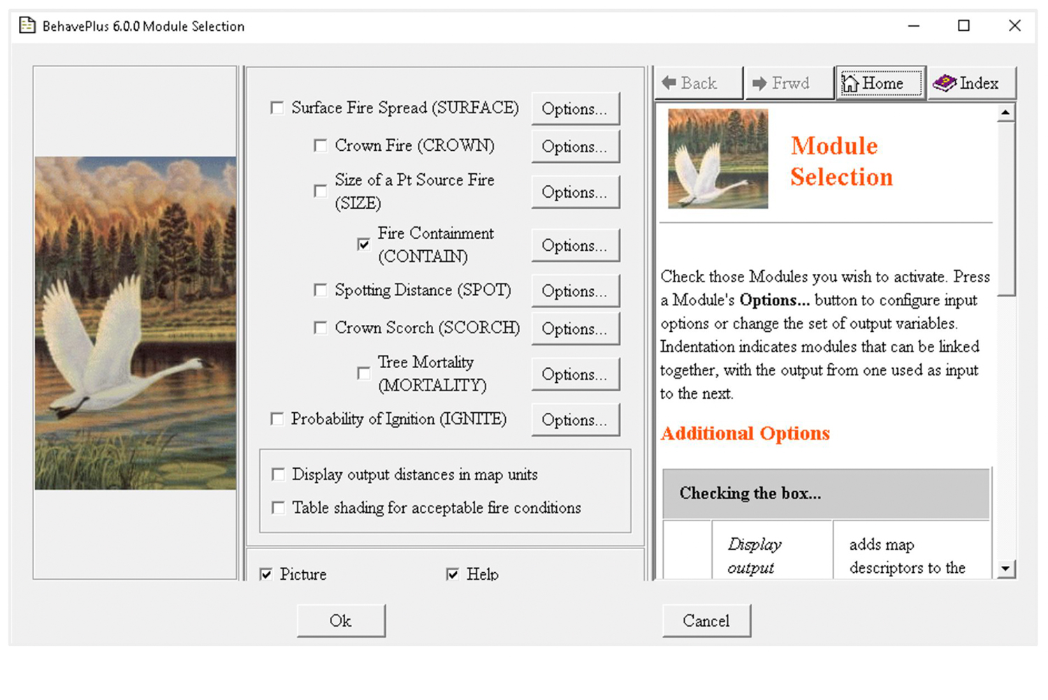
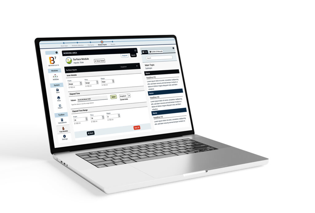
The legacy interface required users to navigate modules, configuration options, documentation, and modeling decisions simultaneously. The redesigned experience preserves those scientific capabilities while organizing them into a clearer sequence, with persistent system tools, a focused working area, contextual guidance, and visible progress through the modeling process.
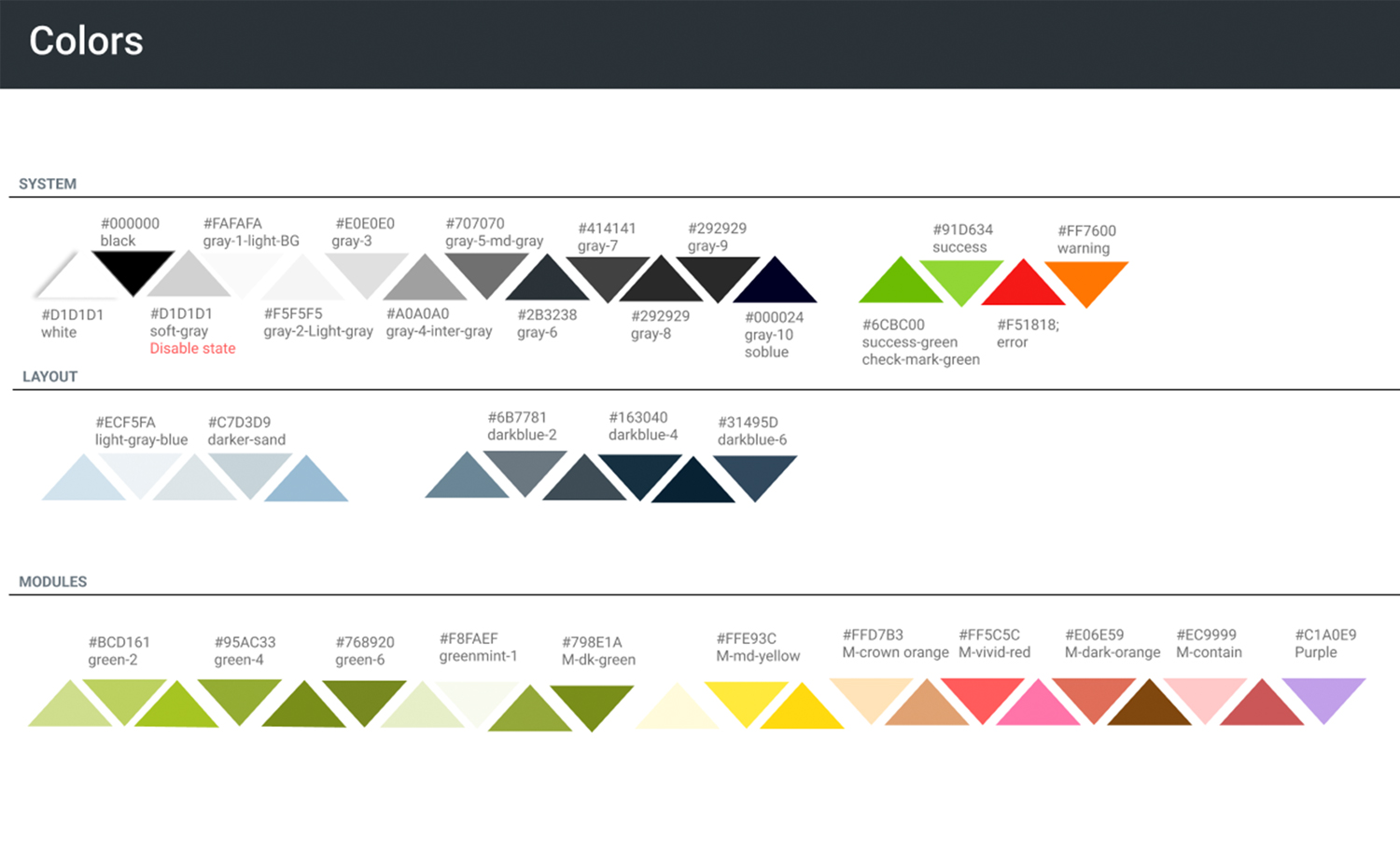
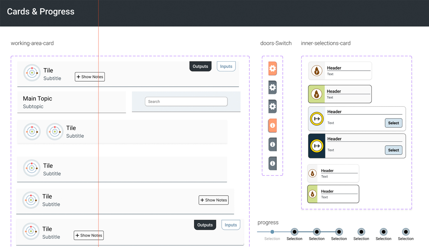
BehavePlus 7 Style Guide. Selected specifications for color, system states, components, and workflow navigation.
Outcomes
FROM TRAINING TO GUIDED LEARNING
BehavePlus 7 brings help and guidance directly into the application, allowing users to find relevant information as they work instead of searching through separate PDF manuals. Combined with the guided workflow, this creates a more continuous learning experience where scientific concepts, configuration decisions, and support are available at the point of need.
COLLEGE-LEVEL TRAINING CLASSES
The redesigned experience reduced the training required to learn BehavePlus from three college-level classes to one.
CONTINUED ITERATION
BehavePlus 7 continues to evolve through implementation, testing, and user feedback. The first release established the redesigned workflow, while subsequent improvements continue to refine the experience as the system develops.
BehavePlus is the world’s most widely used wildfire behavior modeling software, developed with the expertise of leading fire scientists. Used by fire professionals, researchers, and agencies to understand and model fire behavior, it combines decades of fire science with an extensive set of modeling capabilities.
Challenge
Redesign a highly specialized scientific tool without compromising the models, terminology, and workflows experienced users depend on—while reducing complexity and making the system easier to learn, navigate, and use.
Users
BehavePlus supports a specialized community of wildfire professionals working across incident response, prescribed fire, land management, research, and education.
Fire Analysts
Near-term fire behavior analysis and forecasting
Incident Operations
Division supervisors · Firefighters · Incident support teams
Type 1 & 2 firefighters · Technical support for active fire operations
User Research that Shaped the Design Strategy
To understand how wildfire professionals use BehavePlus, I conducted an initial research study combining surveys and focus-group discussions. The research examined usability challenges, user experience levels, and opportunities to simplify workflows without compromising the scientific rigor of the system.
participants
66 wildfire professionals, researchers, and educators participated, providing perspectives from both experienced BehavePlus users and people newer to the software.
Insights
The research revealed a central tension: users valued the scientific power of BehavePlus, but needed simpler workflows and more accessible controls.
1
SIMPLIFY THE WORKFLOW
Users needed fewer steps and clearer pathways through complex modeling tasks without reducing the scientific capabilities of BehavePlus.
2
REDUCE THE LEARNING CURVE
New and occasional users struggled to understand where to begin, while experienced users relied heavily on familiarity and training to navigate the system.
3
MAKE INPUTS EASIER TO UNDERSTAND
Technical parameters, terminology, and configuration options needed stronger context and clearer guidance at the point of use.
4
IMPROVE NAVIGATION & ORIENTATION
Users needed a clearer sense of where they were in the workflow, what had already been configured, and what remained before running a model.
5
SUPPORT REUSE, NOT REPETITION
Frequently used configurations and worksheets needed to be easier to save, retrieve, modify, and reuse rather than rebuilt for every analysis.
6
PRESERVE SCIENTIFIC POWER
Simplification could not come at the expense of BehavePlus’s modeling capabilities. The redesign needed to make the system easier to understand while preserving its scientific complexity.
Architecture
System architecture analysis revealed that the interface mirrored the internal scientific model rather than the mental models of its users.
I mapped the existing workflows, modules, controls, and calculation dependencies to understand how the system was structured and where complexity accumulated. This analysis exposed redundant paths, overlapping controls, and opportunities to reorganize the experience around user tasks while preserving the scientific relationships behind the models.
Reviewing the existing application structure to evaluate its tools, components, relationships, and relevance to user workflows.
BehavePlus 7 Interface architecture and workflow mapping used to identify complexity and redundant interaction paths
Mapping module relationships and calculation dependencies in the BehavePlus modeling system
Design System
The design system evolved through multiple iterations, with each prototype tested against the needs of the people who would actually use it.
The second prototype moved the design from assumptions to observed behavior.
Testing revealed that several interface decisions did not match how users actually interacted with the system. Two findings had the greatest impact: typography was too small for comfortable extended use, and users expected the progress indicator to function as navigation.
BehavePlus first prototype
BehavePlus prototype for user testing
BehavePlus prototype after user testing
New BehavePlus 7 design
Prototype Evolution
Two findings had a particularly significant impact on the design.
TYPOGRAPHY & READABILITY
Testing shifted typography from a visual-system decision to an accessibility and usability requirement.
The initial type scale was too small for comfortable extended use. Testing with BehavePlus users revealed the need for greater readability among experienced professionals who often use the software for prolonged periods. The typography system was revised with larger type and improved readability to reduce visual strain during extended use.
PROGRESS INDICATOR → NAVIGATION
Testing revealed that users understood the progress bar as an interactive navigation tool, not simply a status indicator.
During usability testing, participants repeatedly attempted to use the progress indicator to move between stages of the workflow. The interaction pattern was consistent enough to change the design. The component was redesigned as navigation, allowing users to understand their position in the process and move directly between completed and available stages.
Implementation
From System-Centered Interface to Guided Workflow
The redesign reorganized BehavePlus around the way users move through a modeling task, rather than exposing the structure of the scientific system all at once.
The legacy interface required users to navigate modules, configuration options, documentation, and modeling decisions simultaneously. The redesigned experience preserves those scientific capabilities while organizing them into a clearer sequence, with persistent system tools, a focused working area, contextual guidance, and visible progress through the modeling process.
BehavePlus 7 Style Guide. Selected specifications for color, system states, components, and workflow navigation.
Outcomes
FROM TRAINING TO GUIDED LEARNING
BehavePlus 7 brings help and guidance directly into the application, allowing users to find relevant information as they work instead of searching through separate PDF manuals. Combined with the guided workflow, this creates a more continuous learning experience where scientific concepts, configuration decisions, and support are available at the point of need.
COLLEGE-LEVEL TRAINING CLASSES
The redesigned experience reduced the training required to learn BehavePlus from three college-level classes to one.
CONTINUED ITERATION
BehavePlus 7 continues to evolve through implementation, testing, and user feedback. The first release established the redesigned workflow, while subsequent improvements continue to refine the experience as the system develops.